Design a logo and color palette for Soapbox!

0
Created on 99designs by Vista
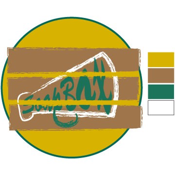
I wanted to go for a vintage style, and really relate to the original use of the 'soap box' and megaphone. I really liked the loudness of the colours, and the style of the font, but i understand its quite difficult to read and not great for a company that wants to keep it's logo simple.