Created on 99designs by Vista
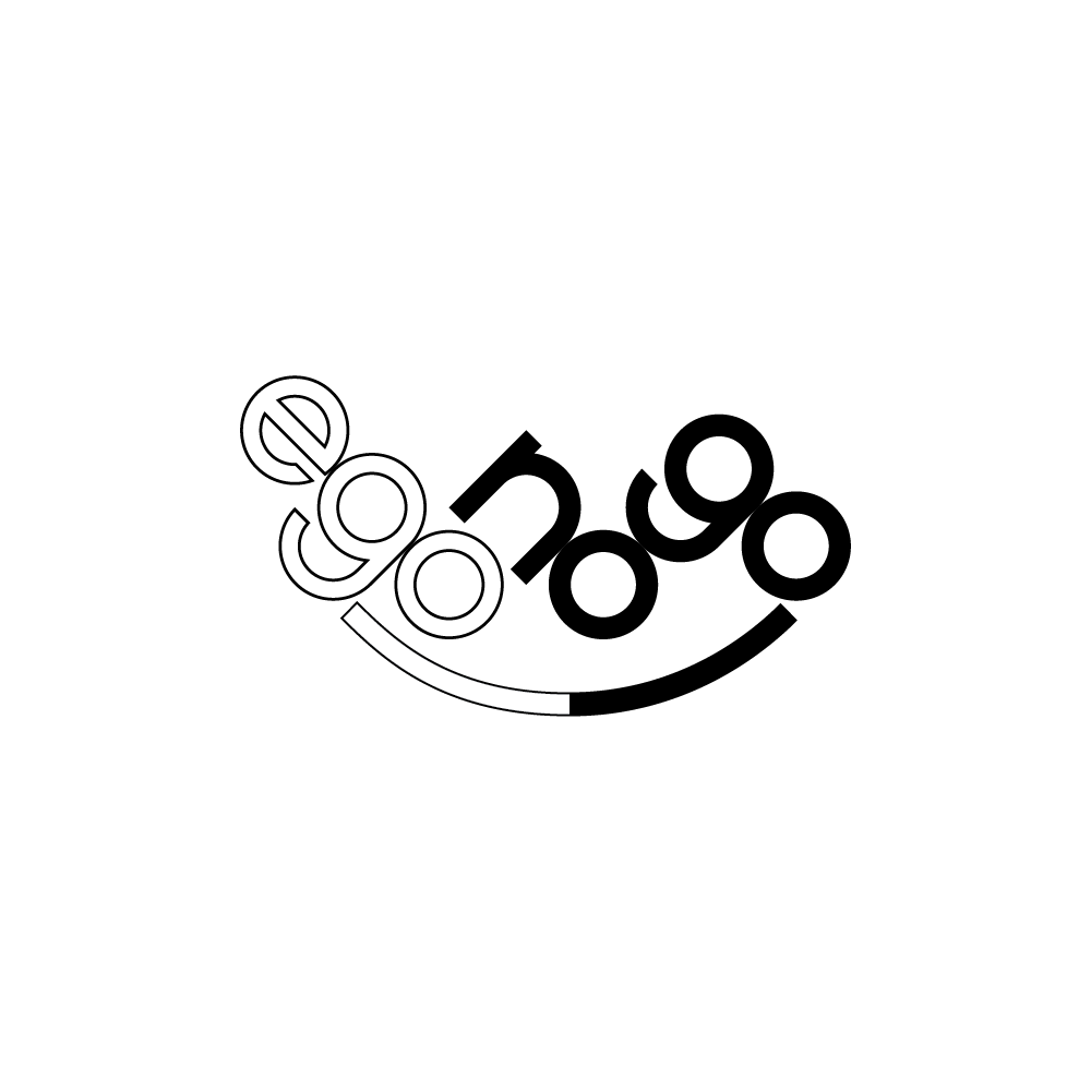
The bold black text emphasises the idea of the name by making EGO look weaker in outlined text.
By turning the text 45 degrees the NO and GO can be read in 2 directions further emphasising that part of the name.
The 3 parts are linked by a happy line both outlined and solid. The composition also looks balanced.
The font has been simply constructed from rectangles and circles.
