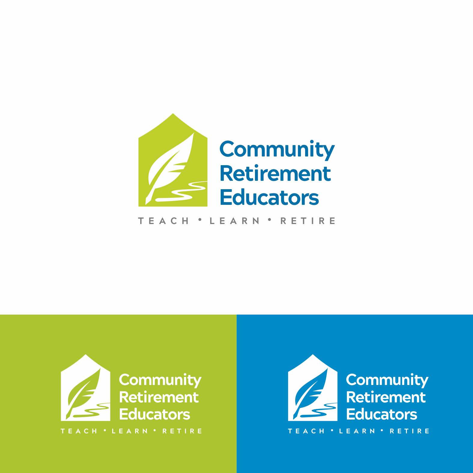
Logo for Community Retirement Educator
32
Created on 99designs by Vista
My logo is very simple visually. But it has story and concept behind it.
The main shape is a house. This house will represent the community.
The quills pen will represent the education process. And also when I choose quill pen instead of pencil or reguler pen is because it was classic and older. So it also symbolize mature/senior people.
The pen leave a line behind.. That talking about what they have achieved. But the ink is not dry yet. So they still have a lot of thing to do. A lot of new purpose.
My logo is trying to bee simple, modern and fresh without losing idea that this is directed for senior people.
