
Created on 99designs by Vista
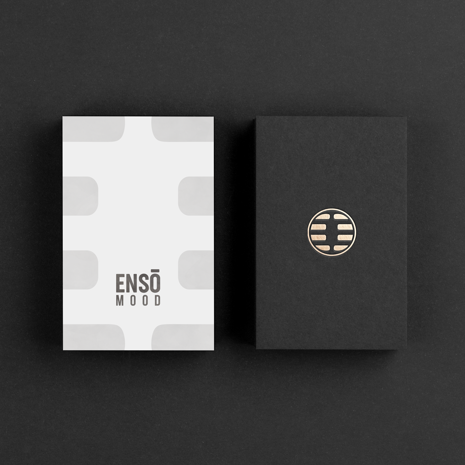
this is a logo that contains in the negative space the E and the M overturned enclosed in a round sign reminiscent of a Japanese aesthetic. The two letters are therefore perceived and felt as a part of a space that contains the fundamental values of the brand. The sign that comes out is clean, clear, and strong. The word-mark is strong but elegant, suitable for all people genres, and again synthetic, no unnecessary frills , only a strong elegant timeless text