
Created on 99designs by Vista
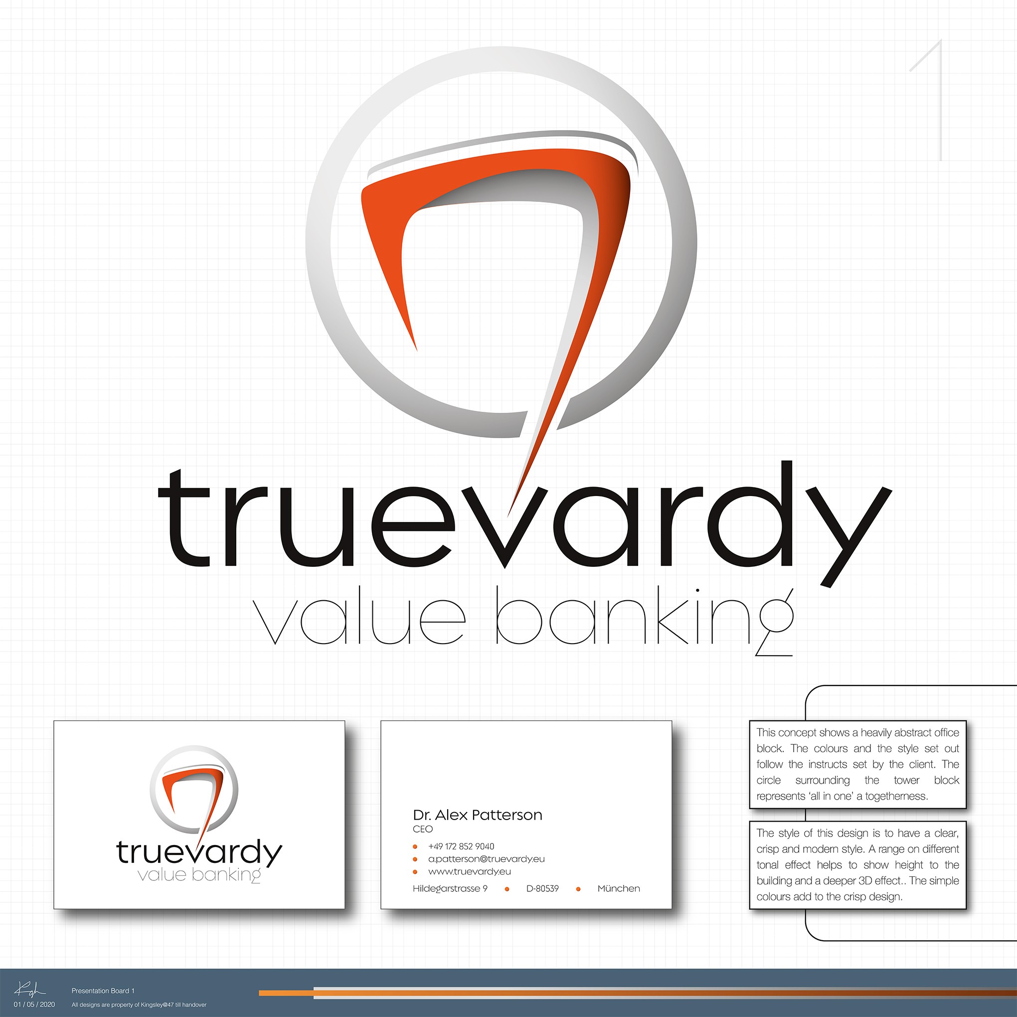
This design work was for a one to one project for a return client. They tasked me to design a concept logo for their start up commercial bank, Truevardy. The literal translation of Truevardy is ‘The true way.’, so the client wanted a design with a form of motion with maybe a path to a building or the source.
This logo utilises the shape and form of the stylised building to add depth to the design and the ring to symbolised the destination. It also gives the destination.