
Created on 99designs by Vista
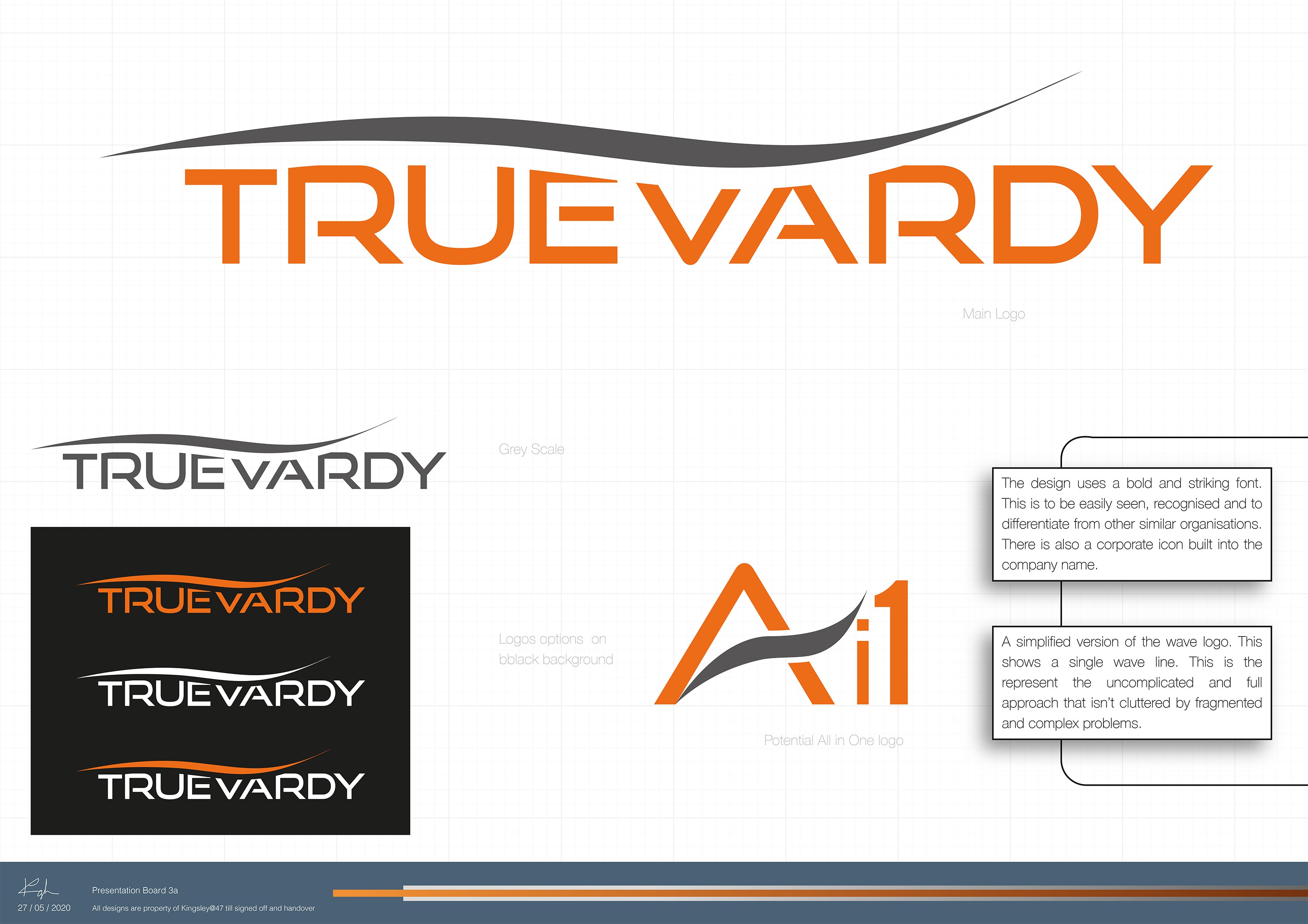
This design work was for a one to one project for a return client. They tasked me to design a concept logo for their start up commercial bank, Truevardy. The literal translation of Truevardy is ‘The true way.’, so the client wanted a design with a form of motion with maybe a path to a building or the source.
After some discussion with the client, they asked it was possible to make the name an integral part of the logo rather than a stand alone icon. The wave form was added above the name but also cut into the wording itself.