
Created on 99designs by Vista
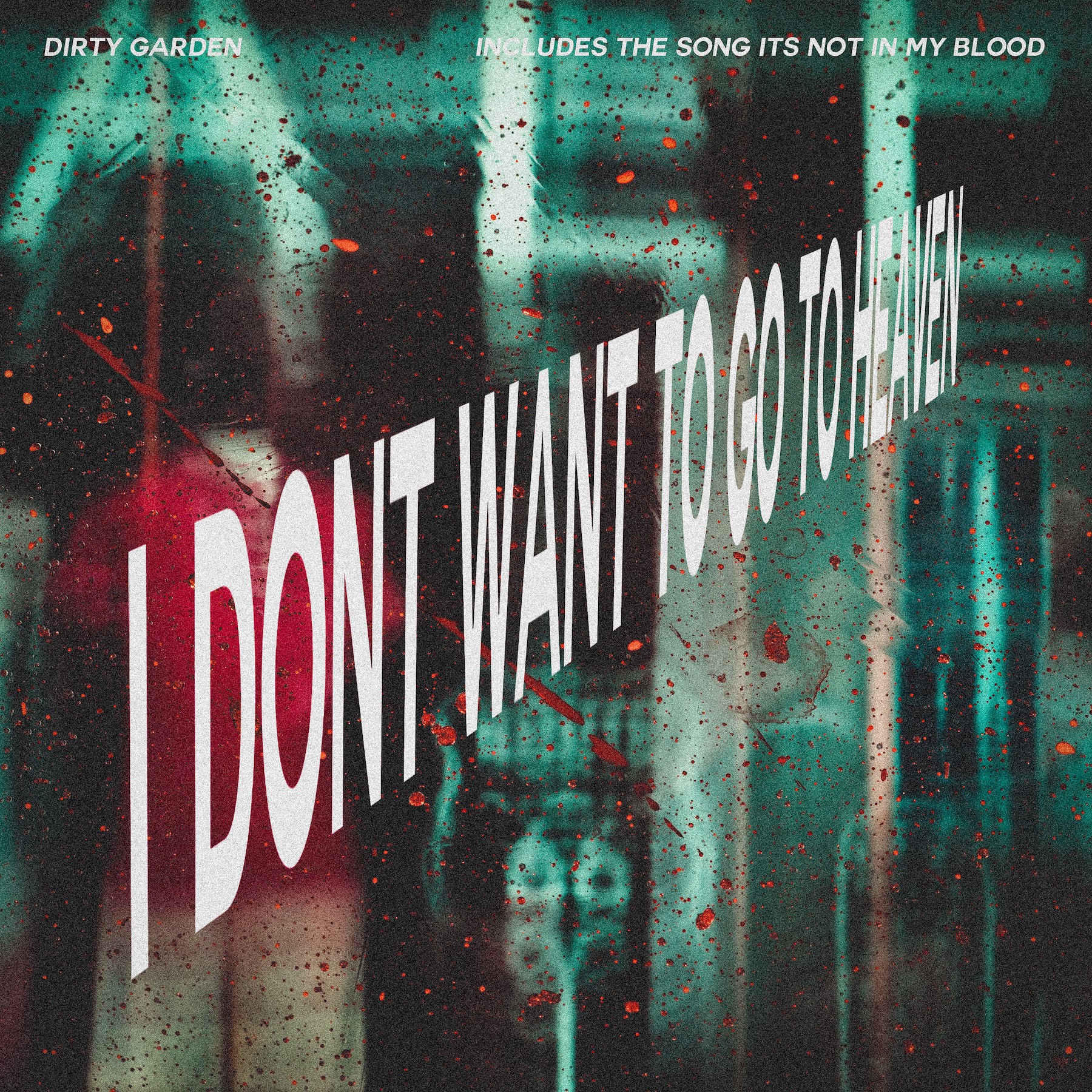
I wanted the name of the EP to take centre stage. I wanted to play with the idea of heaven and have the text style in that way, almost like the stairway to heaven, however, the background be a complete contrast. I chose this image after going through a lot of images, because of the colour palette, it's radically different from your other artwork. However, I feel it grabs attention and that's what is needed with album artwork. I included very minimal text on the top, to show the other song and the name of the band, the top left could be replaced with the current band logo, as that would still work well, in a while flat colour.