
Created on 99designs by Vista
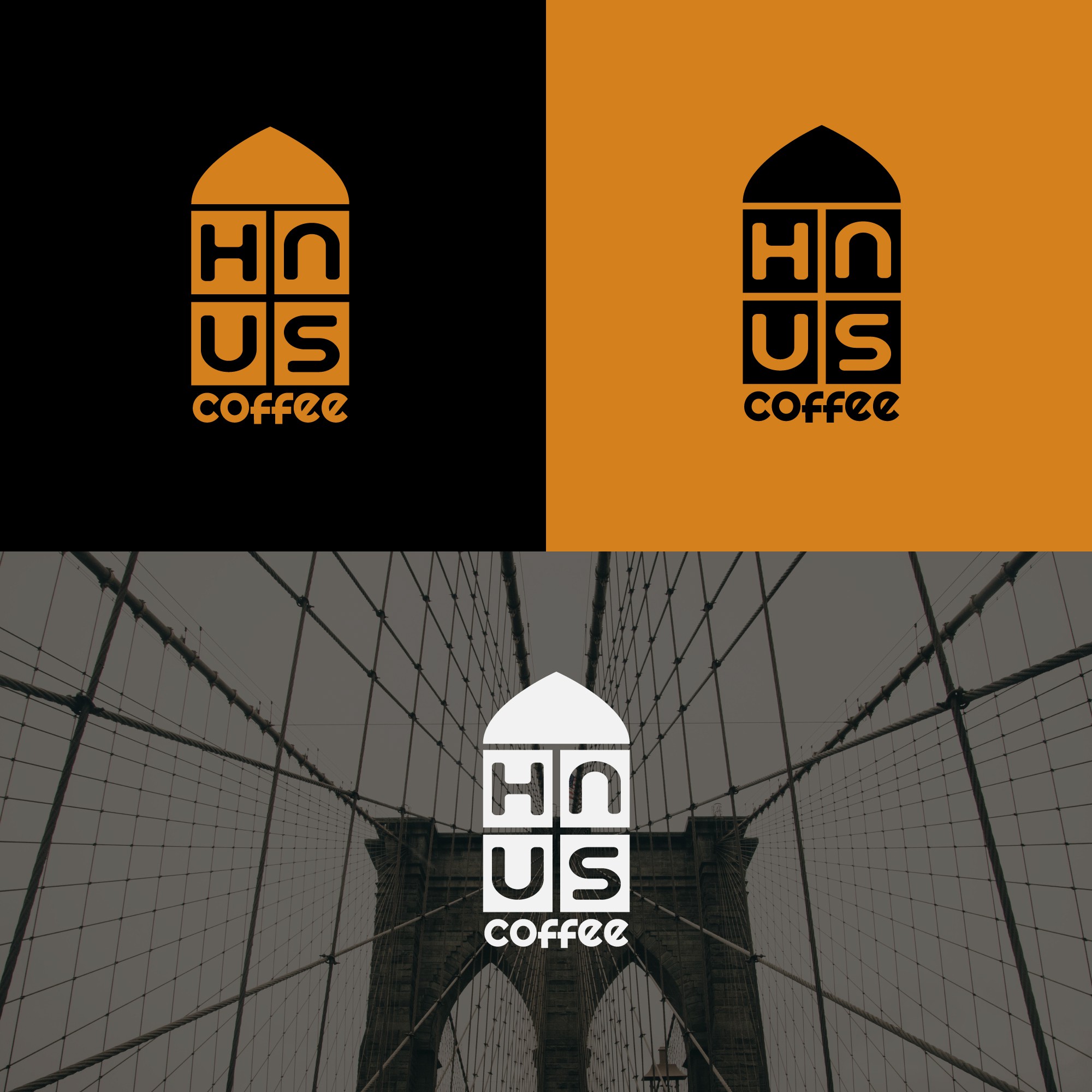
This Logo concept is based on the location and name of the coffee shop (you can see there is an element that represents the Brooklyn Bridge). Negative space is used for the creation and placement of elements that make up the symbol in a harmonious and planned manner, representing the brand name. This logo is boldly designed to represent strong energy and feeling. This logo is also designed to look minimalist and elegant so that it is easy to remember and recognize. This logo is so sturdy that it can stand alone as a brand. The logo also makes it possible for brands to develop their products and markets more easily.