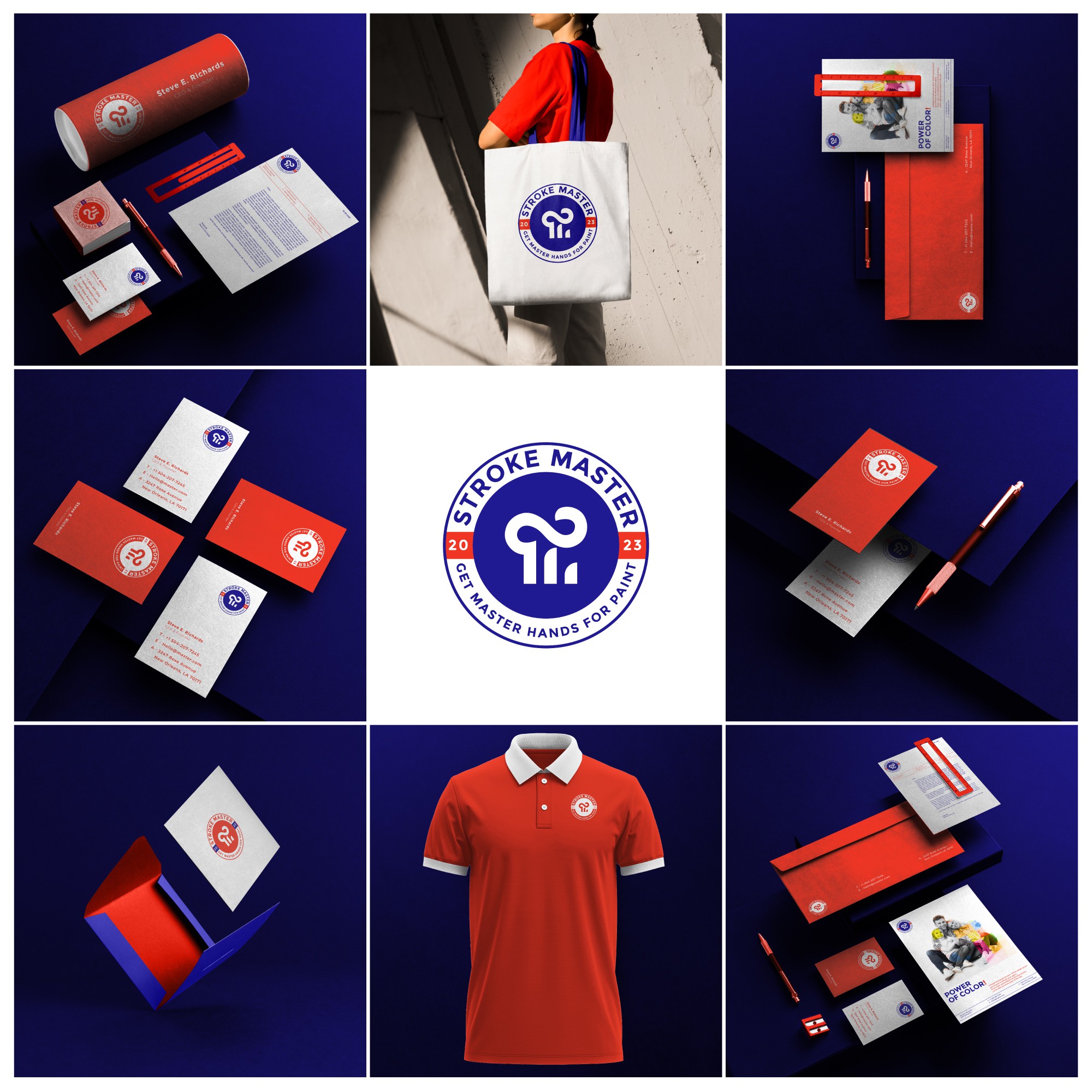

The integration of the letters "S" and "M" suggests unity and coherence. Combining letters creatively can create a unique and memorable logo. You might have overlapped, intertwined, or merged the letters to form a cohesive and visually interesting symbol. This integration signifies the unity of services offered by Stroke Master.
Since Stroke Master is a painting company, incorporating a paintbrush or a brushstroke element is a great way to symbolize the nature of the business. The brushstroke can represent precision, creativity, and the artistic touch that Stroke Master brings to its work. It adds a visual cue about the company's core services.