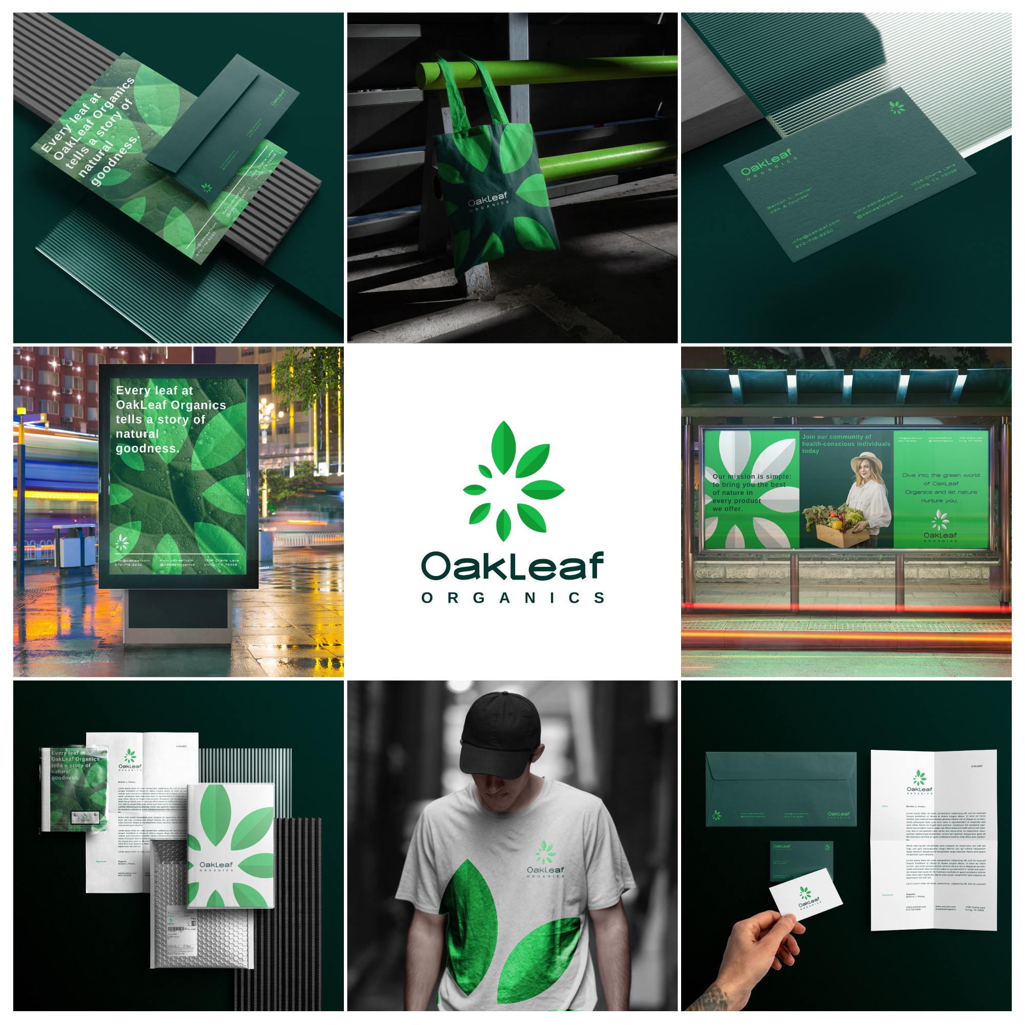

You might have used the letter "O" as a base or frame for your logo design. The circular shape of the letter "O" can symbolize unity, wholeness, and natural cycles, aligning well with the organic theme. It can serve as the foundation upon which the leaf element is integrated.
Integrating a leaf or a series of leaves into the letter "O" signifies the organic and nature-centric aspect of Oakleaf's business. Leaves represent growth, freshness, and vitality, making them ideal symbols for organic products. The design of the leaves could vary, ranging from realistic to stylized, depending on the overall style you want to achieve.
Keeping the design simple ensures that the logo is versatile and easily identifiable. Avoiding overly intricate details allows for scalability, ensuring the logo looks good on various platforms, from business cards to billboards.