
Created on 99designs by Vista
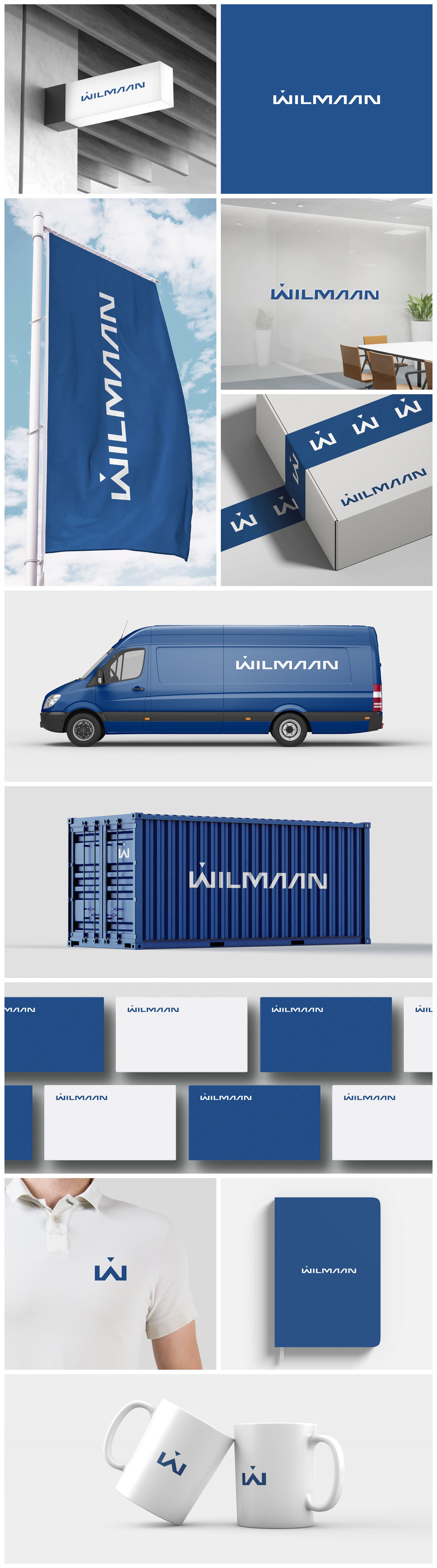
Wilmaan is an international business company, specializing in supply, sourcing, OEM, purchasing, export/import and distribution of raw materials + goods, global shipping services.
For this company I decided to design a unique font that would be very clean and would speak about the professionalism and globality of the company. The customer asked me to highlight the letter W in some way, and I made a small triangle above W.
Thus, the logo remains as a wordmark and the emphasis does not shift completely to the first letter. So it's a small stroke that allows to use the first letter as a separate icon