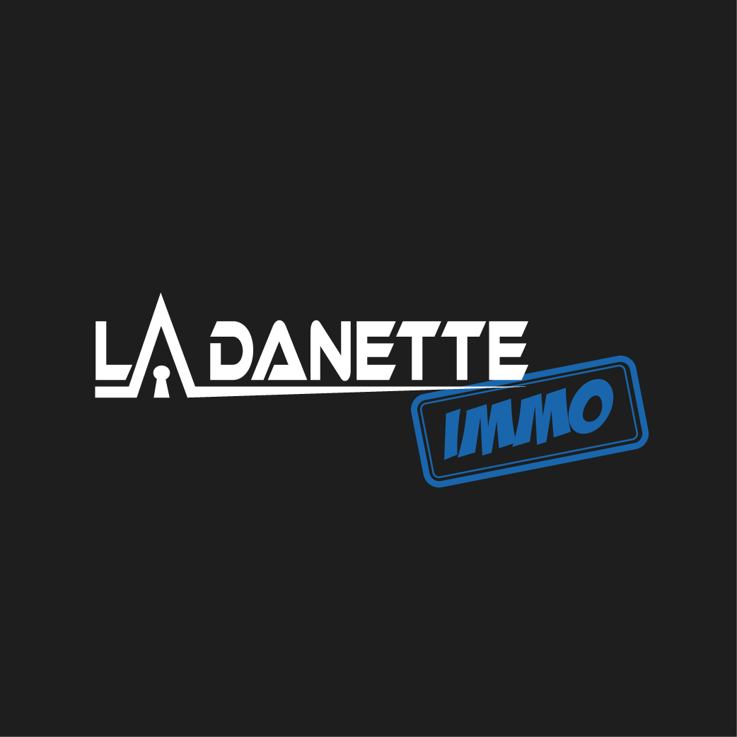
This logo was created for an external client, investor and independent real estate advisor: La Danette Immo. He wanted his logo to represent his work, but also his personality.
The font chosen for "La Danette" was inspired by his passion for motocross.
The blue of "immo" is synonymous with confidence and serenity. The word "immo" is encapsulated in a rectangular shape echoing a rubber stamp.
Finally, the symbolism of the logo is done in a very assertive first degree, through a roof and a keyhole, the meaning of which I don't need to explain ;)
