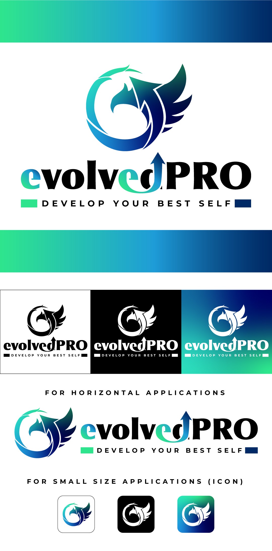
EvollvedPRO - logo for a professional development platform

18
Created on 99designs by Vista
The client was looking for a logo that would work well both on printed and digital materials.
A powerful but classy logo that should instantly recalls high-end, expensive, best you can buy.
the logotype concept is based around an arrow pointing up, a simple but powerful concept. We can find this arrow both in the logo (that represents a phoenix) and the brand naming giving consistency to the branding.
the color palette speaks both business and self improvement, with the base colors range varying from green to dark blue, leaving the classy-high end feel to be dealt by a clean logotype.