Typography album cover

0
Created on 99designs by Vista
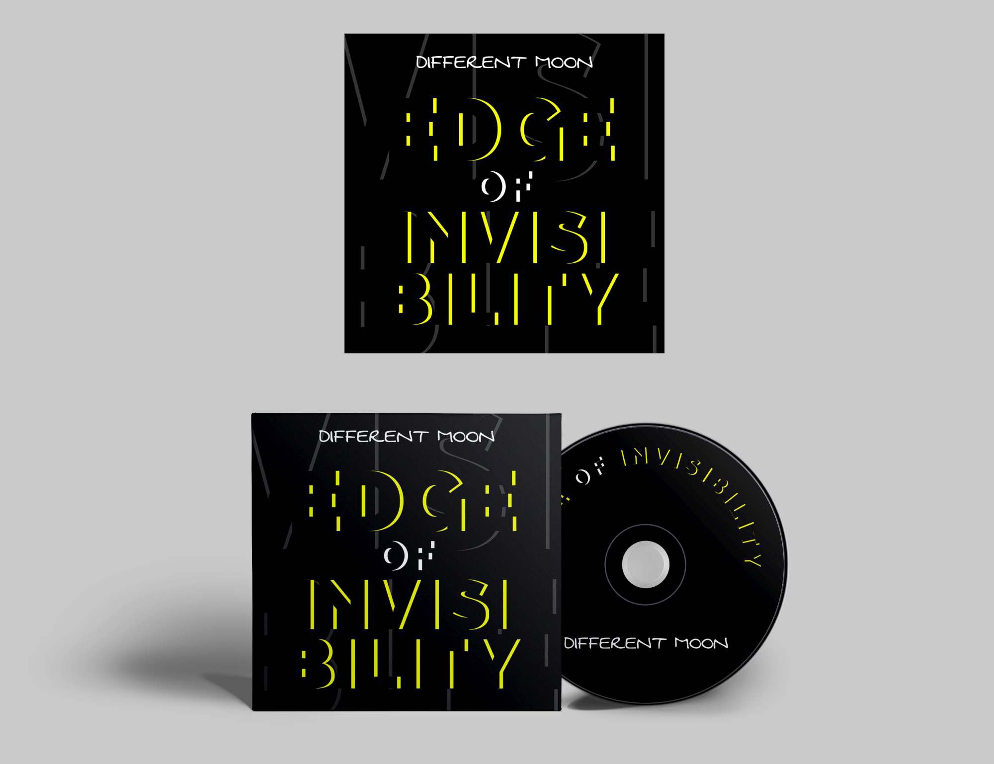
The idea behind the design was to only use typography because I really liked the title of the album. I created a yellow "edge" to the "invisible" letters. I used yellow because it looks like the letters are being lit up from behind, thus the idea of good things that are somehow revealed from the darkness, this being the idea behind the album title. I added the word VISIBLE in the background to emphasize this idea.