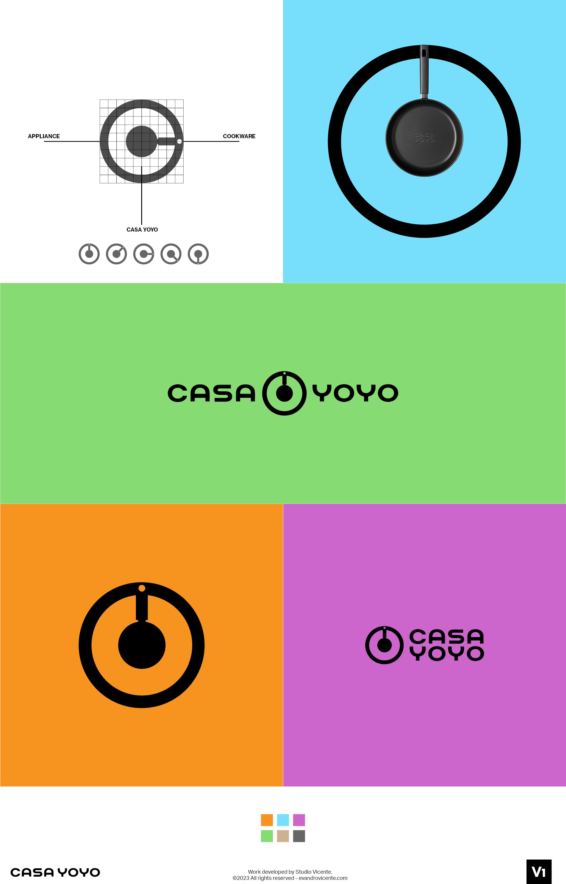

This concept is inspired by the design of housewares and appliances from the 90's to the present day. In most appliances such as old stoves, microwaves/ovens, stereos and washing machines, as the design of the main controllers is rounded, this was thought to facilitate consumer usability in a simple turn. The symbol is a combination of a kitchen utensil and an appliance controller and I wanted to bring this concept to the brand in order to better represent Casa Yoyo's range of high quality products. No matter which angle it is viewed from, the symbol will still represent the brand concept, whether on products or advertising. In fact, the movement gives even more meaning to the brand concept and the countless possibilities of application in the brand book.