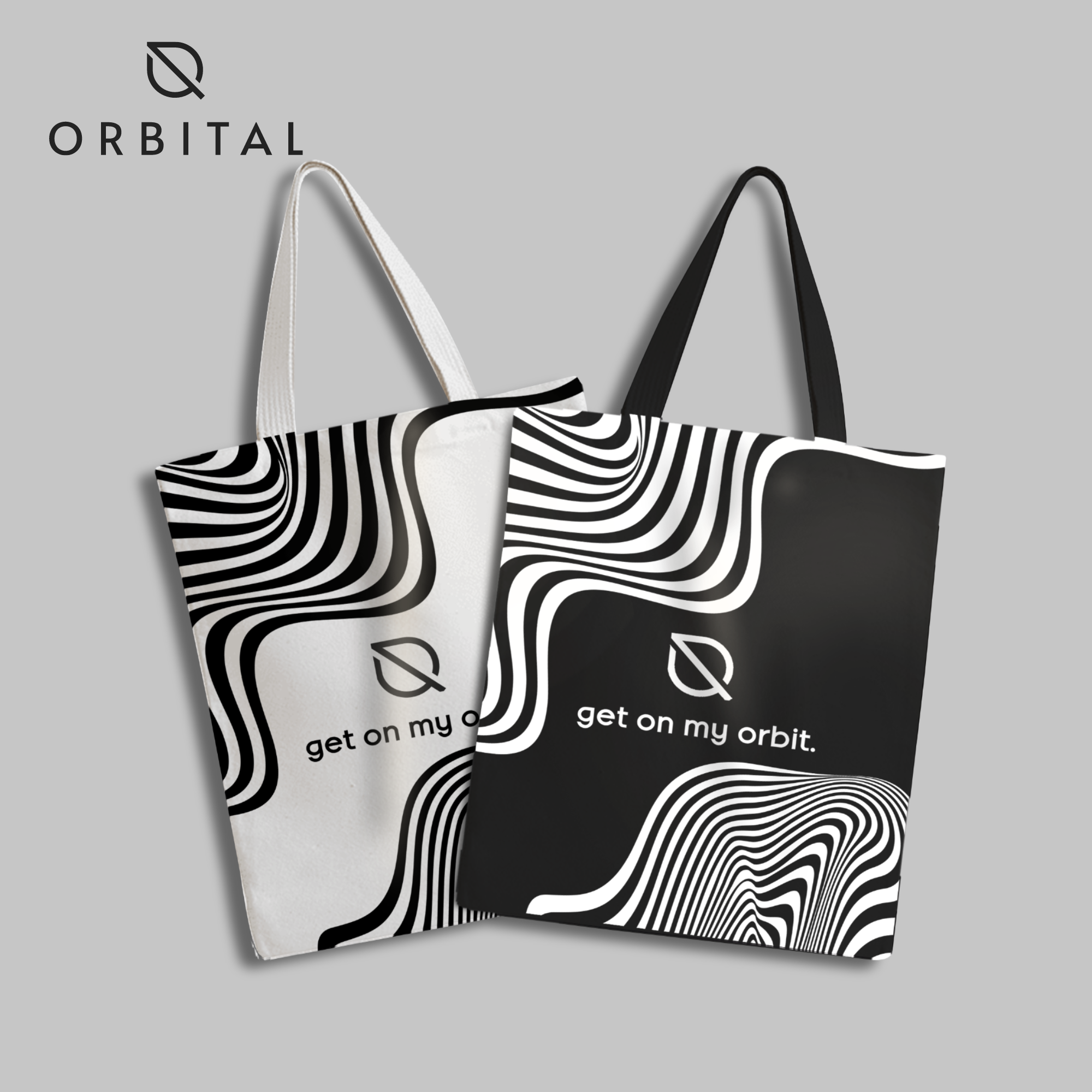

Logo + Branding Concept for Orbital Cannabis Dispensary. The inspiration behind this logo is to convey a sense of luxury and modernity for the cannabis dispensary store. By merging a leaf with a planet in orbit, the logo represents the natural origins of the product, while also encapsulating the store's modern and clean interior design. The minimalistic half-circle orbital lane adds a touch of elegance and sophistication to the logo, appealing to a wide range of customers from young adults to seniors. This design is a subtle nod to the product while avoiding the typical 'stoner' stereotype imagery associated with cannabis. The clean, sharp and modern design of the logo represents the store's commitment to providing a high-end and refined cannabis shopping experience.