
Created on 99designs by Vista
But, let's go to what really matters:
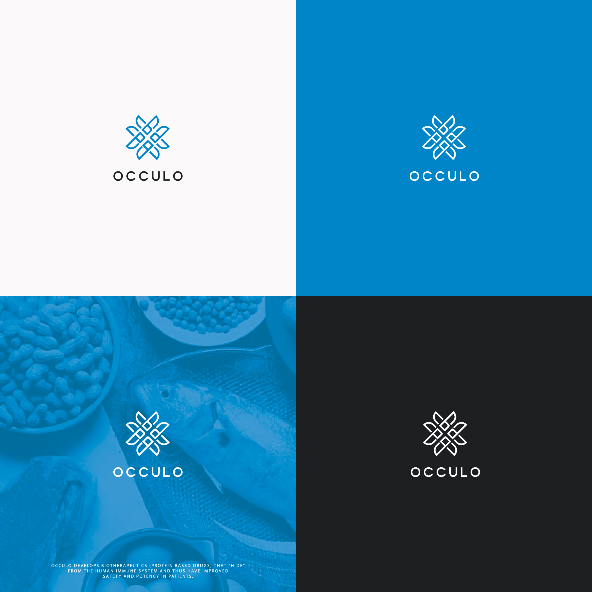
Style: Minimalist
Primary Color: Blue
Secondary color: White
Logo elements:
4 letters O
Leaves formed by minimalist lines (Which refer to the beak of fish)
Thought behind the drawing:
Basically the logo was designed thinking about the briefing, I tried to bring elements of carbohydrate like, fish sheets and an initial letter of the company.
The idea is that the minimalist format, and the division that lines construct, represents a nutritional table (which refers to several elements) within a "Drug" for example.
The cool of all these meanings are when the logo is the presentation, you can explain it to customers, giving more meaning to the "hidden"