
Created on 99designs by Vista
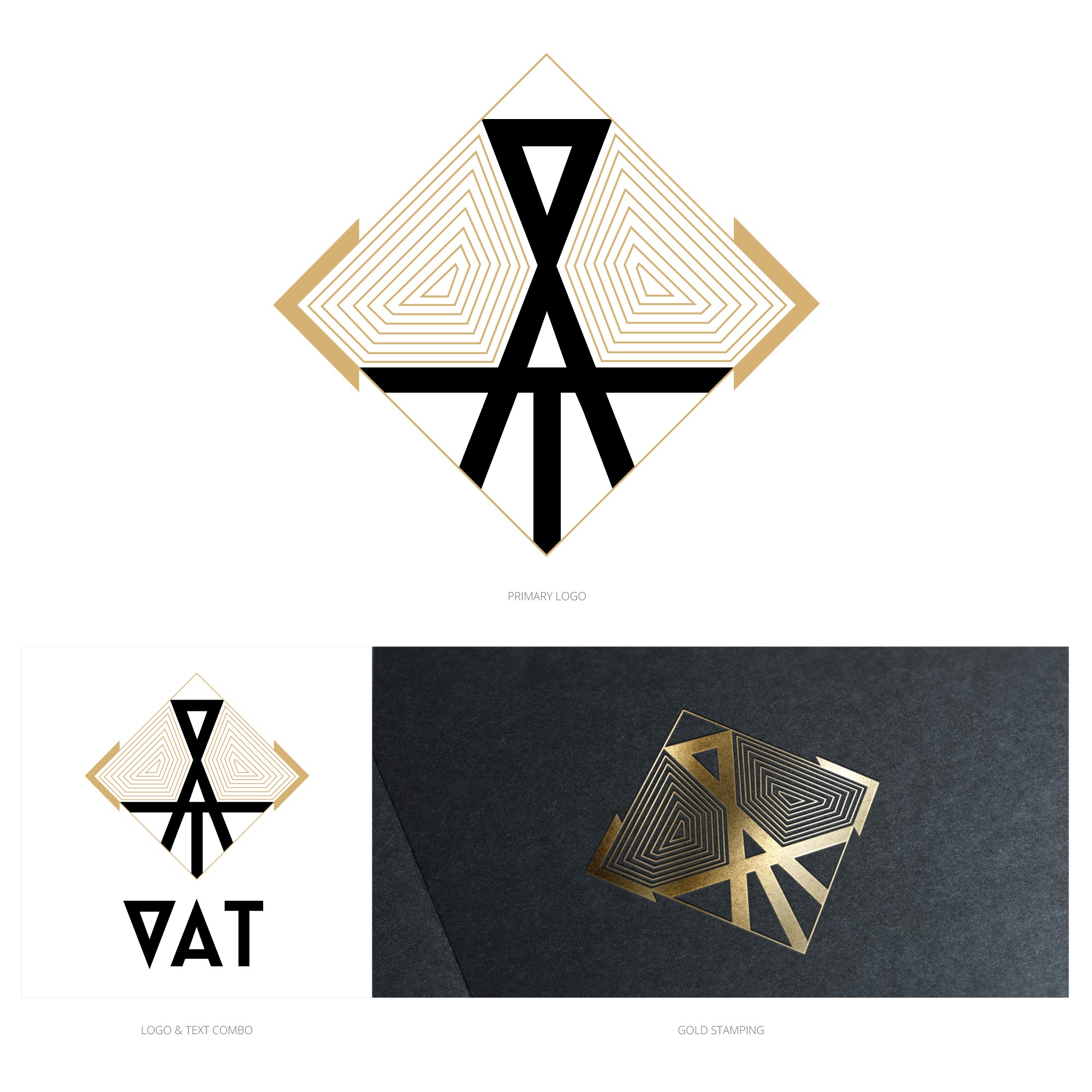
The client requested that the three letters to include within the logo should be intertwined. I arranged VAT from the top to the bottom and kept it geometrical. The colour use and overall aesthetic is consistent with the art deco style.