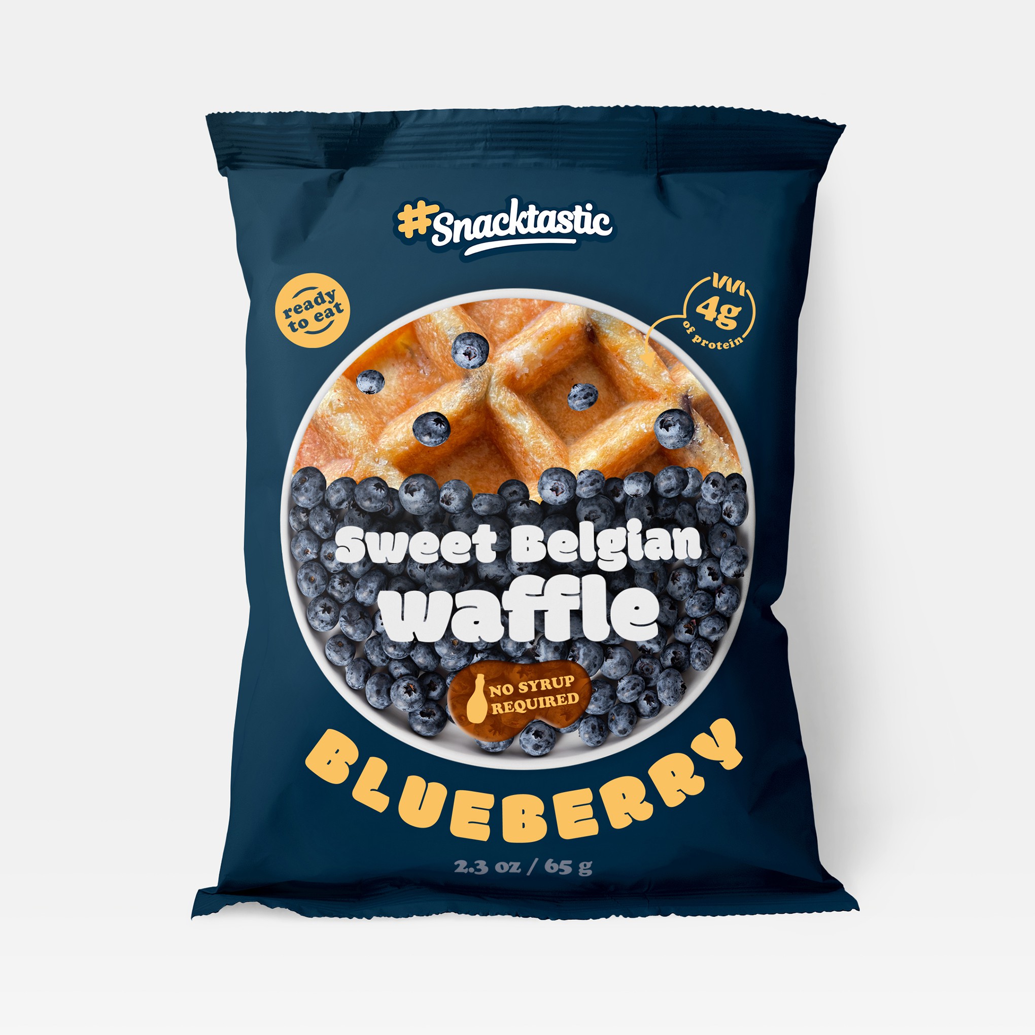

This proposal is focused on the plate half filled with appealing blueberries, and half being the window to the product. There are some stray blueberries that would be printed on top of the window, literally on top of the waffle.
The one plate idea is supposed to suggest an entire breakfast experience.
The logo is simplified to two colors, while keeping the original yellow which is used in the rest of the design as well.
The additional information is displayed in individual shapes, and has icons to be better understood - plate for "ready to eat", and a protein strand for the grams of protein. And lastly, a bottle of syrup with the required information, placed on top of a syrup shape.
The font chosen is reminiscent of waffles, being round and thick, easy to read on top of the fruits.
The design is easily customisable for other flavors as well (by changing the background color, and the fruits in the half-plate)