
Created on 99designs by Vista
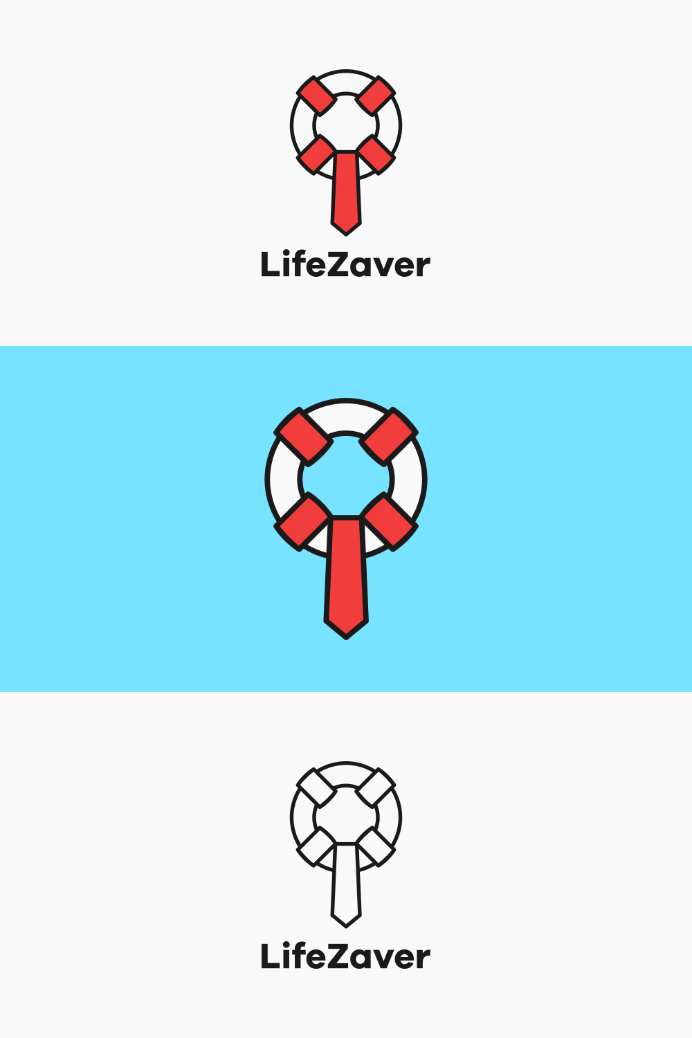
This logo stayed true to its namesake, with simple yet strong representations of both a life preserver and a necktie (to signify the product's business applications).
The proposal included examples of how the logo looked with and without text, as well as with varying levels of color.