Refined Logo for an investment fund company

0
Created on 99designs by Vista
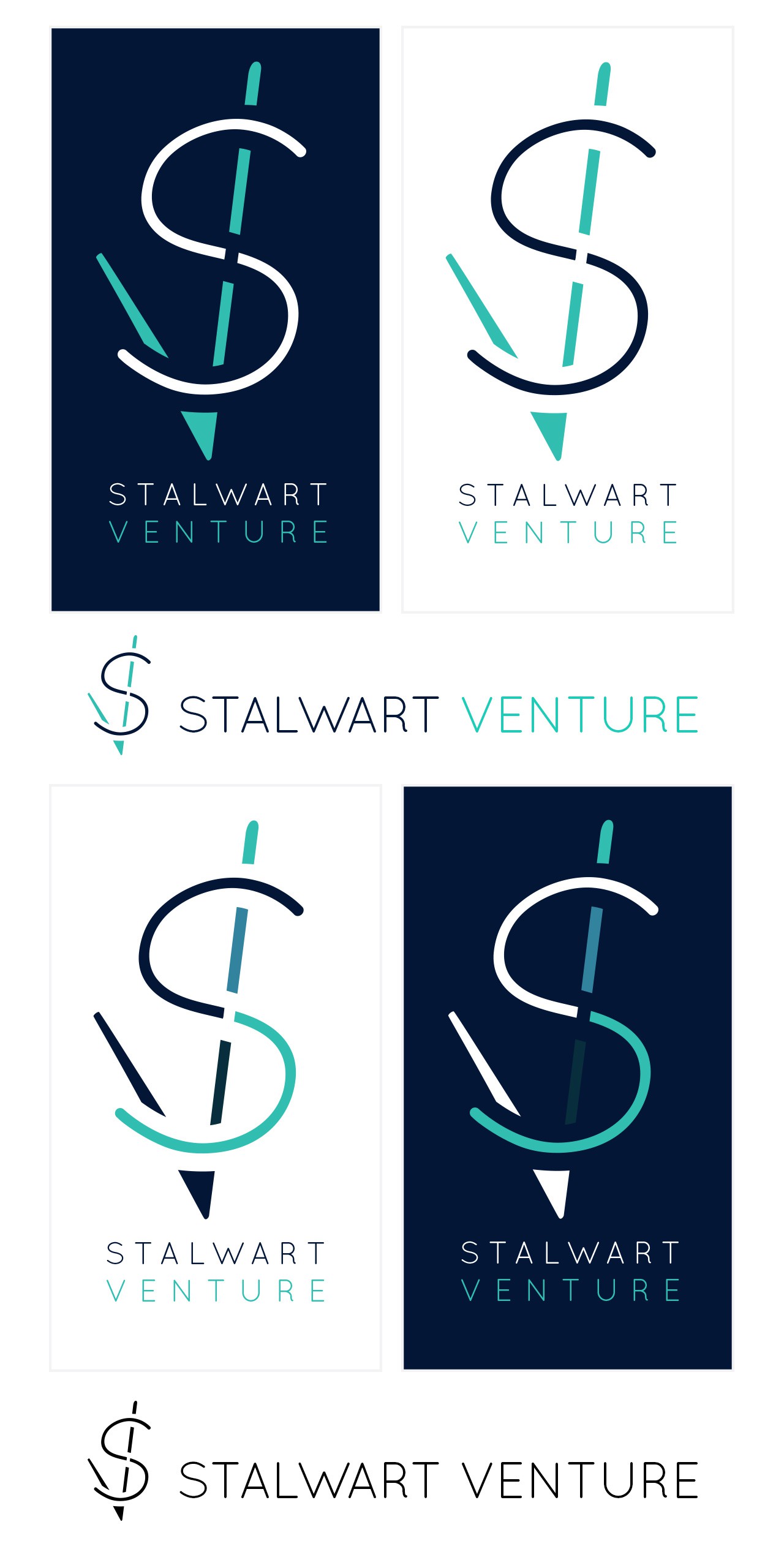
Hi ! First, excuse my english, i'm so french! This logo was made with some signs in mind : a checkmark and a dollar.
It's obviously the S and the V from Stalwart Venture and i make it more abstract with 5 colors variations. I also propose a 3 colors variations to keep it much simple.
The alternate colors on the dotted line also shows the studies mades along the path to achieve the repetitive annual gain visible through the S.
So the S represent a path along validation (checkmark), and the V looks like a bounce with vivid colors on top.
Finally, it's a simple logo with lines that can easily be reproduced by hand (so by brain) to appropriate and to sign any papers.
Hope you'll see it as i do !