How to choose the right logo color
Discover the psychology of color and use our logo color discovery tool to find the best one for your business. Get ready to attract customers and boost your brand.

by Pinch Studio
You love red. Your phone case is red. Your Chucks are red. You’re chewing Big Red. Your logo color should be red, right? Not so fast...
Every color has a meaning and a personality, and that’s why selecting the right logo color can make or break your business. Luckily, our design nerds have analyzed over 14,000 logos so you can position your brand for success (yes, there’s actually science behind this).
Let’s find you the perfect logo color!
Let’s find you the perfect logo color!
How does color work?
Color is everywhere, and whether you know it or not each color you encounter gives you an emotional experience. Green and blue evoke a feeling of calm, and yellow makes you feel upbeat (and hungry).
Understanding the psychology of color can be a valuable asset for designers and entrepreneurs when choosing brand colors. Choosing the right colors means your audience will instantly know who you are, what you do and what you’re about. And—no joke—the wrong colors can drive them away.
Check out these three uses of color in packaging:
-
 by Martis Lupus
 -
by katerina k.
-
by Emir Alicic
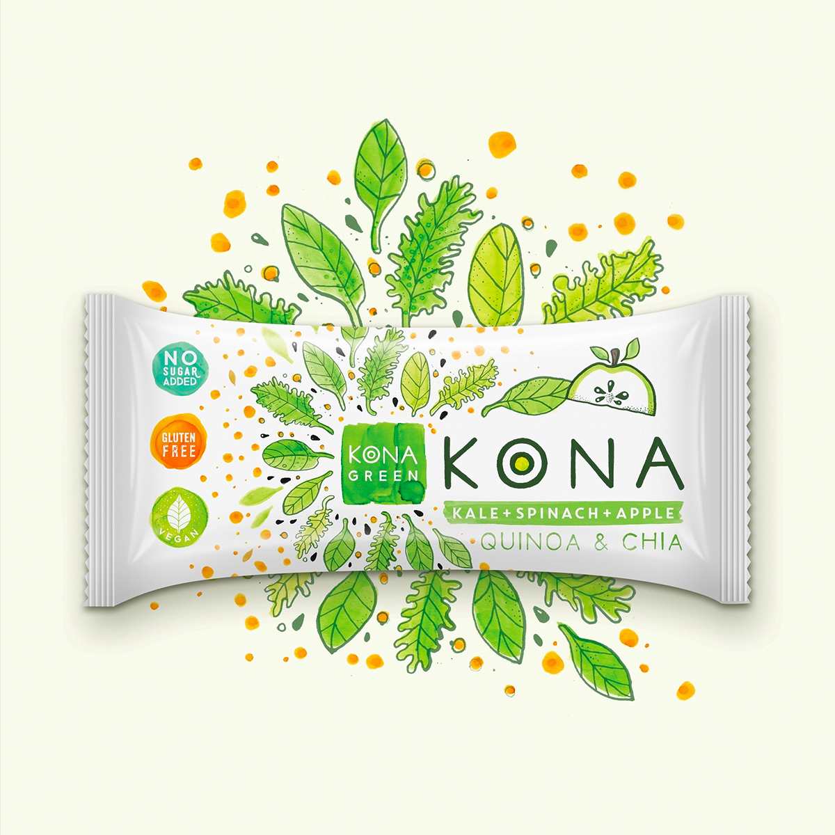


Each color speaks to a different aspect of the consumer. Green elicits peace and well-being. Pink is feminine with a touch of luxury. Brown is an earthy color associated with stability (doesn’t hurt that it’s the color of coffee, too).
Successful businesses use color meaning and psychology to influence a consumer’s brand experience.
Successful businesses use color meaning and psychology to influence a consumer’s brand experience.
What colors work best for you?
Just like colors, your brand has a personality of its own, and consumers go after products that match their own personalities. Defining your brand personality helps customers make purchasing decisions, and it helps you target the right people.
So, what’s your brand personality? Start by asking yourself these six questions:
So, what’s your brand personality? Start by asking yourself these six questions:
- Gender: Is my brand traditionally masculine or feminine?
- Tone: Is my brand playful or serious?
- Value: Is my brand luxurious or affordable?
- Time: Is my brand modern or classic?
- Age: Is my brand youthful or mature?
- Energy: Is my brand loud or subdued?
Introducing the 99d logo color generator
We’ve partnered with Pantone and Adobe to help you decide which color from Pantone’s 2019 palette you should use in your design. Use the sliders below to tell us your brand personality, and we’ll translate that into a primary logo color.

Your primary logo color is red, the universal sign of excitement, passion, anger and stimulated appetites. Think stop signs, agitated bulls and fast food joints. Looking for loud, playful, youthful or modern? Red’s your go-to.
If you’re going the red route, Pantone recommends using Cherry Tomato to stay on-trend with this year’s palette. Cherry Tomato is a powerful shade of red that packs an energetic punch sure to leave a lasting impact on your audience.
If you’re going the red route, Pantone recommends using Cherry Tomato to stay on-trend with this year’s palette. Cherry Tomato is a powerful shade of red that packs an energetic punch sure to leave a lasting impact on your audience.
Your primary logo color is orange. Orange is an invigorating, playful color, the love child of red (warmth) and yellow (joy). Go orange to stand out from the crowd. It’s used less often than red, but still packs an energetic punch.
Pantone recommends Flame Orange in this year’s palette. If you decide to make Flame Orange the focal color of your designs, make sure to balance it out with plenty of neutrals to avoid making the end design visually overwhelming.
Pantone recommends Flame Orange in this year’s palette. If you decide to make Flame Orange the focal color of your designs, make sure to balance it out with plenty of neutrals to avoid making the end design visually overwhelming.
Your primary logo color is yellow, which is all about accessible, sunshiney friendliness. Yellow exudes cheer (think sunflowers and smiley faces). Choose yellow and your brand will radiate an affordable, youthful energy.
This year, Blazing Yellow made the cut in Pantone’s palette of the year. Use this hue in your design to stay ahead of trend and evoke warmth in your audience.
This year, Blazing Yellow made the cut in Pantone’s palette of the year. Use this hue in your design to stay ahead of trend and evoke warmth in your audience.
Your primary logo color is green, the ultimate in versatility. Green isn’t linked with specific personality traits, but it has strong cultural associations. It’s connected to nature, growth, rebirth and in the US … money and prosperity. So, whether you’re in finance or gardening, green may be for you.
This year’s Pantone shade of Lime Green is a little bit different. The vibrant lime hue is a little bolder, a little brighter, and a little more vibrant than more traditional shades of green—which adds a fun, youthful spin you won’t find in more subdued variations.
This year’s Pantone shade of Lime Green is a little bit different. The vibrant lime hue is a little bolder, a little brighter, and a little more vibrant than more traditional shades of green—which adds a fun, youthful spin you won’t find in more subdued variations.
Your primary logo color is blue, the king of colors. Blue appears in over half of all logos because it represents intelligence, trustworthiness and maturity. Technology companies and large corporations lean towards blue’s steadfastness and security. True blue will make sure you’re taken seriously.
Pantone chose not one but two shades of blue for this year’s palette. Dazzling Blue is a classic dark blue that you can work into any design in any industry. Meanwhile, its sibling hue, Hawaiian Ocean, is a brilliant turquoise that evokes images of the ocean and is thus best for brands that want to be associated with calm, peace and tranquility.
Pantone chose not one but two shades of blue for this year’s palette. Dazzling Blue is a classic dark blue that you can work into any design in any industry. Meanwhile, its sibling hue, Hawaiian Ocean, is a brilliant turquoise that evokes images of the ocean and is thus best for brands that want to be associated with calm, peace and tranquility.
Your primary logo color is purple, a warm and cool combination that blends the passion of red with the serenity of blue. Go with purple to appear luxurious, cutting-edge or wise. There’s just a hint of femininity in there, too.
Pantone lists Fuschia Purple in their palette of the year. It’s more of a pink than a purple, but because this shade is so vibrant, it can inspire feelings of excitement and passion like its parent color, red. Use Fuschia Purple in your design to blend the boundaries of purple, pink and red.
Pantone lists Fuschia Purple in their palette of the year. It’s more of a pink than a purple, but because this shade is so vibrant, it can inspire feelings of excitement and passion like its parent color, red. Use Fuschia Purple in your design to blend the boundaries of purple, pink and red.
Your primary logo color is pink, which represents romance and femininity, but is also incredibly versatile. From millennial pink to neon magenta, pick pink for a modern, youthful, luxurious look.
Pantone lists Fuschia Purple in their palette of the year, though the hue is more like a reddish pink. Because this pink is so bright and close to red, the bold color choice would be just as effective for any kind of retail design. Use Fuschia Purple in your design to blend the boundaries of purple, pink and red.
Pantone lists Fuschia Purple in their palette of the year, though the hue is more like a reddish pink. Because this pink is so bright and close to red, the bold color choice would be just as effective for any kind of retail design. Use Fuschia Purple in your design to blend the boundaries of purple, pink and red.
Make your brand appear rugged, masculine or serious. Brown is very underutilized, so you’ll stand out from the competition.
Black is the new black. Want to look slick, modern and luxurious? Time to go black. Rather be economical and affordable? Stay away from the dark side.
The absence of color. White is youthful and economical, but can work for almost any brand. As a neutral color, consider white as a secondary accent.
Not quite dark, not quite light. Gray is the middleground of mature, classic and serious. Go darker to add mystery. Go lighter to be more accessible.
Stay trendy!
Design trends change every year. While it's impossible to update your brand's color palette after every Times Square ball drop, just being aware of the latest color trends can do your brand some good.
Our logo generator is based on Pantone's 2019 color palette, but make sure you also consider their 2019 Color of the Year, Living Coral. This vibrant, mellow coral color inspires warmth, optimism and joy.

That doesn't mean you should change your entire logo to Living Coral, but consider using it as an accent on your website and marketing materials so your audience knows you're on trend.
What are your industry colors?
Now that you have a sense of your brand personality colors, see where you fit in your industry.
Some industries lean toward certain colors. Tech favors blue and retail chooses red, agriculture goes with green. You can play it safe and join the crowd, or take a risk and do your own thing.
Some industries lean toward certain colors. Tech favors blue and retail chooses red, agriculture goes with green. You can play it safe and join the crowd, or take a risk and do your own thing.
Want more details on your marketplace? Head on over to your industry page:
Accounting | Agriculture | Healthcare | Legal | Marketing & PR | Real Estate | Retail | Technology
Accounting | Agriculture | Healthcare | Legal | Marketing & PR | Real Estate | Retail | Technology
Over the rainbow? Go with your gut.
Here’s your big takeaway: the best logo color for your business is the one that fits your brand. Most of the time that means follow psychology of color, and our Color-O-Matic tool will give you our best guess of the perfect color matches your business.
But if you’re looking at your logo color and thinking, “That just doesn’t feel right…” Then, it’s time for a gut check. If you’ve always wanted a red logo, then, dang it, get yourself a red logo! Just remember the emotions that your customers will bring to their experience with your business.
But if you’re looking at your logo color and thinking, “That just doesn’t feel right…” Then, it’s time for a gut check. If you’ve always wanted a red logo, then, dang it, get yourself a red logo! Just remember the emotions that your customers will bring to their experience with your business.
More awesome logo color resources!
Check out these articles for more details about color meaning, the psychology of color and brand personality:
- Color meanings and the art of using color psychology
- The fundamentals of understanding color theory
- Branding colors: everything you need to choose your brand’s perfect pigments
- What is brand identity? And how to design and develop a great one
- Logo colors: what’s best for your brand?
- How color impacts emotions and behaviors
Get a logo design now!
Your inbox needs a little color
Subscribe now for tips and trends that’ll leave you tickled pink (or purple or yellow or green).
We'll also send you the occasional marketing email or promotion, which you can opt-out of anytime.